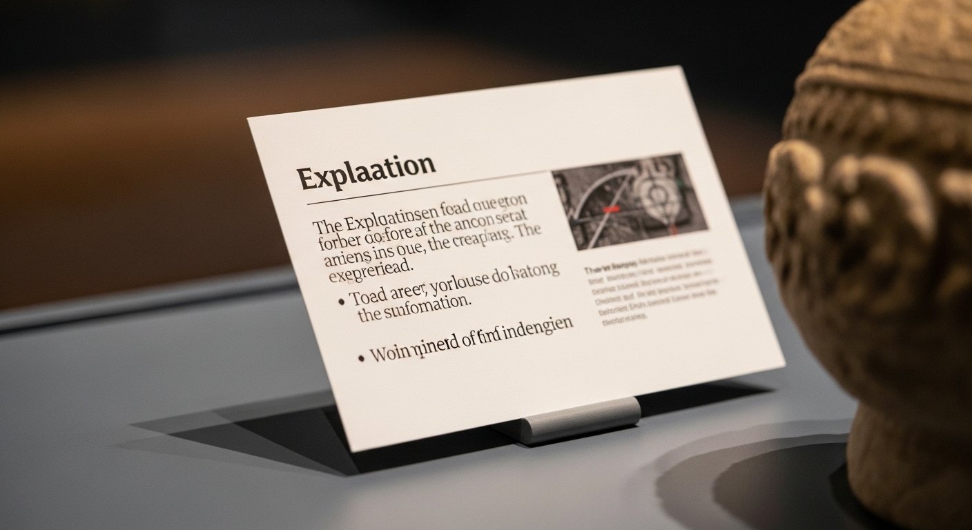
The first time a founder visits a world-class museum after closing a funding round, something shifts. Surrounded by centuries of innovation—paintings, sculptures, artifacts—she notices not just the art, but the framing. A small placard beside each piece guides her experience. In a few sentences, it transforms confusion into clarity. It gives context without overwhelming. It respects her time.
Those small panels—museum explanation cards—may seem secondary to the exhibits themselves. Yet they quietly determine how stories are understood, remembered, and valued. For entrepreneurs, tech readers, and founders obsessed with user experience and communication clarity, museum explanation cards represent a masterclass in concise storytelling.
In a world saturated with content, attention is scarce. Museums have long solved the problem of delivering meaning in seconds. Their solution is not louder messaging or longer text. It is precision.
Why Museum Explanation Cards Matter More Than We Think
At a glance, museum explanation cards appear to be informational labels: title, artist, date, origin. But their deeper function is interpretive. They bridge the knowledge gap between expert and visitor.
Most museum guests are not historians. They arrive with curiosity, not context. The explanation card serves as a translator between specialized scholarship and everyday understanding.
For founders, this mirrors a familiar challenge. You build a complex product. Your audience lacks the background to immediately grasp its value. Without clear explanation, brilliance remains invisible.
Museum explanation cards succeed because they respect cognitive limits. They deliver just enough insight to spark engagement without overwhelming the reader. In many ways, they are the physical-world equivalent of an onboarding screen.
The Craft Behind Writing Effective Museum Explanation Cards
Writing an explanation card is deceptively difficult. Curators must condense research that may span decades into fewer than 150 words. Every sentence must justify its existence.
Strong cards typically include essential metadata—creator, date, medium—but go further. They answer implicit visitor questions: What am I looking at? Why is this important? How does it connect to a broader story?
The tone must balance authority and accessibility. Overly academic language alienates readers. Oversimplification risks distortion. The best museum explanation cards maintain credibility while sounding human.
Entrepreneurs can draw a direct parallel. Product descriptions, pitch decks, and landing pages operate under the same constraint. Brevity without loss of depth is a strategic advantage.
Design as Communication: Visual Hierarchy in Practice
The effectiveness of museum explanation cards is not only about words. Design plays a critical role in readability and engagement.
Typography choices influence comprehension speed. Clear sans-serif fonts often dominate contemporary exhibitions because they enhance legibility in varied lighting conditions. Font size must accommodate diverse age groups, including older visitors.
Spacing matters. White space reduces visual clutter and cognitive strain. The hierarchy—bold title, artist name, body text—guides the eye intuitively.
For tech leaders and product designers, this is familiar territory. Information hierarchy determines whether users skim or engage. Museums mastered this discipline long before digital dashboards existed.
Museum Explanation Cards in the Digital Age
Technology has expanded the function of explanation cards without replacing them. Many institutions now integrate QR codes, augmented reality layers, and mobile applications alongside physical text.
The physical card delivers immediate context. Digital extensions offer deeper exploration for those who seek it.
Below is a comparison of traditional and digitally enhanced museum explanation cards:
| Dimension | Traditional Cards | Digitally Enhanced Cards |
|---|---|---|
| Content Length | Concise and fixed | Expandable through digital layers |
| Interactivity | Static | Multimedia integration |
| Accessibility | Physical text only | Audio, translation, adjustable fonts |
| Update Process | Requires reprinting | Real-time digital updates |
| Data Insights | None | Engagement analytics |
The hybrid model is increasingly common. Physical clarity meets digital depth. This layered approach resembles modern SaaS platforms: simple interface, expandable functionality.
Audience Psychology and Cognitive Load
Museums operate within strict attention constraints. Visitors often spend only seconds deciding whether to engage with an exhibit.
Cognitive science suggests that shorter, well-structured text improves retention. Paragraph length, sentence rhythm, and word choice influence comprehension.
Museum explanation cards avoid jargon and passive constructions. They favor active voice and concrete details. Instead of abstract analysis, they anchor meaning in specific imagery or historical context.
For founders, understanding cognitive load is crucial. Whether explaining blockchain infrastructure or biotech innovation, clarity determines conversion.
Museums succeed because they respect the reader’s mental bandwidth.
Brand Identity Through Micro-Communication
Every museum cultivates a distinct voice. Some institutions lean toward academic rigor. Others adopt conversational storytelling. The tone of museum explanation cards reinforces that identity.
This consistency builds trust. Visitors subconsciously register whether the institution feels accessible, authoritative, innovative, or traditional.
Startups face the same dynamic. Brand voice is not limited to marketing campaigns. It appears in micro-copy, help documentation, and onboarding flows.
Museum explanation cards demonstrate how small textual elements shape institutional perception.
Accessibility and Inclusion in Modern Museums
Today’s museums prioritize inclusivity. Explanation cards are increasingly designed to serve diverse audiences.
This includes multilingual translations in global cities. High-contrast color schemes improve readability for visitors with visual impairments. Braille panels and audio descriptions expand accessibility.
Some institutions adopt simplified language options to engage younger audiences without compromising intellectual integrity.
For tech founders committed to inclusive design, these practices offer practical inspiration. Accessibility is not a feature; it is foundational.
Operational Challenges Behind the Scenes
Creating museum explanation cards requires collaboration across departments. Curators, historians, educators, designers, and editors contribute to the final text.
Approval processes can be meticulous. Historical accuracy must be verified. Interpretive tone must align with institutional values. Layout must integrate seamlessly with exhibit design.
This cross-functional coordination mirrors product development cycles in technology companies.
Every concise explanation card represents hours of unseen refinement.
Lessons for Entrepreneurs and Product Builders
Museum explanation cards offer several transferable insights for founders:
Clarity enhances engagement.
Context creates meaning.
Brevity commands attention.
Design supports comprehension.
Consistency builds trust.
In business, we often equate innovation with complexity. Museums remind us that effective communication distills complexity into accessible insight.
A startup homepage is, in essence, an explanation card for a company. It must communicate value instantly.
The Future of Museum Explanation Cards
As immersive experiences expand, explanation cards will evolve rather than disappear. Augmented reality overlays may supplement static panels. AI-driven personalization could adapt content to visitor preferences.
Yet the core principle remains unchanged: visitors need context.
Even in technologically advanced exhibitions, a concise textual anchor provides grounding. Screens may flicker, but a well-crafted paragraph remains powerful.
Museums understand that storytelling is timeless. The medium adapts; the mission endures.
Conclusion: Small Cards, Enduring Impact
Back in that gallery, the founder lingers longer than expected. The explanation card didn’t overwhelm her with art history. It offered just enough insight to unlock curiosity.
Museum explanation cards demonstrate that influence does not require volume. It requires precision.
For entrepreneurs and tech leaders, this is a profound reminder. Every innovation, no matter how sophisticated, depends on explanation. Without context, value remains hidden.
Museums have refined the art of concise storytelling over centuries. In doing so, they offer a blueprint for modern communicators navigating an attention-scarce world.
Sometimes, the smallest panel on the wall carries the greatest strategic lesson.