Late at night in a quiet workspace, a product designer adjusts the layout of a mobile application. On one screen, the interface looks perfect on a desktop monitor. On another, the same design appears cramped on a smartphone. On a third device, a tablet version stretches awkwardly across the screen.
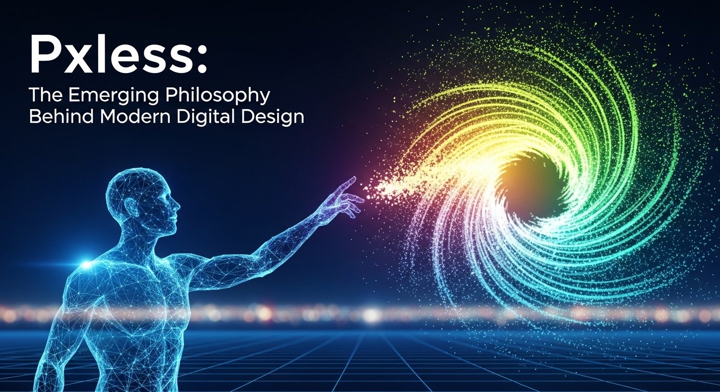
Moments like these have pushed designers and developers toward a new mindset often described as pxless.
In modern web and application development, pxless represents a design philosophy that moves beyond fixed pixel measurements toward flexible, responsive units that adapt to different devices and screen sizes. Rather than defining layout elements strictly in pixels, designers rely on scalable units, relative spacing, and responsive frameworks.
For entrepreneurs, tech readers, and founders building digital products, understanding pxless thinking is increasingly important. As users interact with technology through a growing variety of devices—smartphones, laptops, tablets, wearables, and even smart TVs—design strategies must evolve to accommodate that diversity.
The pxless approach reflects a broader shift in digital design: from rigid layouts to adaptable user experiences.
The Problem With Pixel-Perfect Design
For many years, designers aimed to create “pixel-perfect” interfaces.
In early web design, developers often specified exact pixel values for margins, fonts, images, and layout components. This approach worked well when most users accessed the internet through desktop monitors with similar resolutions.
However, the rapid expansion of mobile technology changed everything.
Smartphones introduced dramatically different screen sizes. Tablets added intermediate formats. High-resolution displays, including Retina screens, further complicated the situation by increasing pixel density.
Suddenly, interfaces designed with rigid pixel measurements struggled to maintain visual consistency.
Buttons became too small on some devices, images appeared distorted on others, and layouts required constant adjustment.
This challenge led designers to rethink how digital interfaces should be structured—and the pxless concept began to emerge.
What the Pxless Philosophy Means
At its core, pxless design encourages developers to focus on flexible, scalable measurements rather than fixed pixel values.
Instead of defining every element with exact dimensions, designers use relative units such as percentages, viewport-based measurements, and scalable typography.
These units allow layouts to adapt naturally as screen sizes change.
For example, rather than assigning a button width of exactly 200 pixels, a pxless approach might define the button as occupying a percentage of its container.
This flexibility ensures that the interface remains visually balanced across different devices.
The pxless philosophy also emphasizes fluid grids, responsive images, and modular components that adjust automatically to the surrounding layout.
Together, these practices create interfaces that feel consistent and intuitive regardless of screen size.
Why Pxless Matters for Modern Startups
For startups and technology founders, adopting a pxless mindset offers practical advantages.
Many digital products launch simultaneously across multiple platforms—web browsers, mobile apps, and sometimes smart devices. Designing separate layouts for each platform can consume valuable time and development resources.
A pxless approach simplifies this process.
By building interfaces that scale naturally, companies can create a unified design system that works across devices with minimal adjustments.
This efficiency is especially valuable for small teams working under tight deadlines.
Additionally, responsive design improves user experience. Visitors who encounter a clean, adaptable interface are more likely to engage with the product and remain loyal to the platform.
In competitive digital markets, usability often determines whether users stay or leave.
The Role of Responsive Design Frameworks
The growth of pxless design has been supported by modern development frameworks that simplify responsive layout creation.
These frameworks provide predefined grid systems, flexible spacing utilities, and components designed to adapt automatically to different screen sizes.
Developers can focus on building functionality while relying on the framework’s responsive structure.
Typography also benefits from pxless strategies. Instead of assigning static font sizes, designers can use scalable units that adjust relative to screen dimensions or root font settings.
This approach ensures that text remains readable on both large monitors and small mobile screens.
Ultimately, pxless design integrates seamlessly with modern front-end development practices, making it easier for teams to build adaptable digital experiences.
Pxless Thinking in User Experience Design
Beyond technical implementation, pxless also represents a shift in user experience philosophy.
Designers are increasingly focused on creating interfaces that respond gracefully to different contexts. Users may interact with a product while commuting, working at a desk, or relaxing at home.
Each environment involves different screen sizes, lighting conditions, and interaction styles.
A pxless design approach prioritizes adaptability.
Layouts rearrange themselves automatically, navigation elements become more accessible on touch screens, and content adjusts to remain readable and visually balanced.
This responsiveness creates a sense of continuity for users moving between devices.
For businesses, that continuity strengthens brand perception and improves overall engagement.
Comparing Traditional Pixel Design and Pxless Design
Understanding the difference between conventional design methods and pxless strategies can help clarify why the latter has gained popularity.
| Design Aspect | Pixel-Based Approach | Pxless Approach |
|---|---|---|
| Layout Measurements | Fixed pixel values | Flexible, relative units |
| Device Compatibility | Often requires separate designs | Adapts automatically to screens |
| Development Effort | Frequent adjustments needed | More efficient scaling |
| User Experience | Inconsistent across devices | Consistent and responsive |
| Long-Term Maintenance | Higher complexity | Easier updates and improvements |
This comparison shows how pxless design aligns with the realities of modern digital ecosystems.
The Technical Tools Behind Pxless Design
Several technologies support the pxless design philosophy.
CSS units such as “em,” “rem,” “vw,” and “vh” allow developers to define sizes relative to fonts or viewport dimensions rather than absolute pixel counts.
Flexible grid systems organize content into columns that expand or contract based on screen width.
Media queries enable layouts to adapt at specific breakpoints, ensuring optimal presentation across devices.
Responsive image techniques also play an important role. Instead of loading a single large image for every user, websites can deliver different versions based on device capabilities.
These technologies collectively allow developers to move away from rigid pixel-based structures and embrace more fluid design systems.
Challenges When Adopting Pxless Strategies
While the pxless approach offers significant benefits, it also introduces certain challenges.
Designers accustomed to pixel-perfect control may initially find flexible layouts difficult to predict. Elements can behave differently across devices, requiring careful testing.
Additionally, responsive systems require thoughtful planning. Without a clear design framework, flexible layouts may become inconsistent or visually cluttered.
Performance considerations also matter. Responsive images, animations, and adaptive components must be optimized to maintain fast loading speeds.
Successful pxless implementation therefore requires collaboration between designers, developers, and product managers.
When executed well, however, the result is a more resilient and future-proof design system.
The Future of Pxless Digital Experiences
As technology continues evolving, the importance of pxless design is likely to grow.
New devices—including foldable smartphones, augmented reality interfaces, and wearable displays—introduce even greater diversity in screen formats.
Rigid pixel-based layouts will struggle to adapt to these emerging environments.
Pxless strategies, on the other hand, are inherently flexible.
Artificial intelligence may soon assist designers by automatically adjusting layouts based on user behavior and device characteristics.
Design systems will become increasingly modular, allowing interfaces to adapt dynamically while maintaining consistent branding and usability.
For founders building digital platforms, investing in flexible design frameworks today can help ensure their products remain relevant as technology continues advancing.
Conclusion: Designing Beyond Pixels
The concept of pxless reflects an important evolution in digital design thinking.
In the early days of the internet, fixed pixel measurements provided clarity and control. But as technology diversified and users began interacting with devices of all shapes and sizes, rigid layouts became limiting.
Pxless design offers a more adaptable solution—one that prioritizes scalability, responsiveness, and user-centered experiences.
For entrepreneurs and technology innovators, adopting this mindset means building products that function seamlessly across the modern digital landscape.
In a world where devices continue multiplying and user expectations continue rising, designing beyond pixels may be the key to creating digital experiences that truly stand the test of time.